





25 Room Divider Ideas for Privacy, Storage, and Style
The best room divider ideas do more than interrupt a view. They give an open room a clearer rhythm while protecting the light, circulation, and character that made the layout appealing in the first place. A divider might create a softly screened sleeping area, build storage into an otherwise unused boundary, or become the artwork that anchors two neighboring zones.
- Quick Takeaways
- How to Choose a Room Divider: Privacy, Light, Function, and Permanence
- Natural and Textile Room Dividers That Keep Things Airy
- 1. Set Birch Poles in a Slim White Planter
- 2. Grow a Tropical Bamboo-and-Plant Screen
- 3. Layer Macramé Panels on a Ceiling Track
- 4. Slide Woven Bamboo Panels Across a Sunny Opening
- 5. Enclose an Emerald Reading Nook With Floral Curtains
- 6. Suspend Oak Slats From a Tension-Pole Frame
- Storage Room Dividers That Make Small Spaces Work Harder
- 7. Paint a Floor-to-Ceiling Library Divider Deep Green
- 8. Combine Black Metal Shelves With Walnut Cabinets
- 9. Build a Double-Sided Cubby Headboard Between Two Beds
- 10. Use an Open Honeycomb Shelf as a Screen
- 11. Frame the Room With an Oak Slat Portal and Bench
- 12. Make a Slim Media Wall Work From Both Sides
- Glass and Light-Filtering Architectural Partitions
- 13. Hang Translucent Botanical Art Panels
- 14. Let a Stained-Glass Screen Cast the Color
- 15. Enclose a Compact Office With Black-Framed Glass
- 16. Mix Cane and Ribbed Glass in Rounded Black Frames
- 17. Build a Retro Color-Block Glass Divider
- 18. Pair Rippled-Glass Circles With Walnut and Cane
- 19. Backlight Stone Beside Walnut Slats and Display Shelves
- Decorative Screens and Sculptural Statement Dividers
- 20. Treat a Colorful Carved Folding Screen as Artwork
- 21. Create a Gothic Botanical Reading-Nook Screen
- 22. Contrast Black Cutwork With Cognac Leather
- 23. Place an Organic Pebble-Cut Wood Screen Behind a Curved Sofa
- 24. Shape Copper Mesh Into a Ribbon Divider
- 25. Illuminate a Wavy Walnut-and-Rippled-Glass Divider
- What to Check Before You Install a Room Divider
- Frequently Asked Questions
- What type of room divider gives privacy without blocking all the light?
- Can a bookcase be used safely as a room divider?
- Do decorative room dividers reduce noise?
- Are tension-pole and freestanding dividers always renter-friendly?
- Choose the Divider Your Room Actually Needs
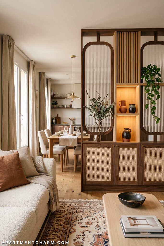
The 25 designs below range from bamboo, curtains, and open shelving to ribbed glass and sculptural metalwork. Each one approaches privacy differently. More importantly, each shows how color, material, scale, and negative space determine whether a divider feels airy, architectural, useful, or deliberately dramatic. Use them to decide what your room needs—and how to make the solution belong there.
Quick Takeaways
- Decide whether you need simple zoning, visual privacy, or a more complete enclosure before choosing a divider for your overall layout.
- Open shelves, slats, mesh, glass, and loose weaves preserve longer sightlines; solid surfaces create stronger separation.
- Let the divider solve a second problem through storage, lighting, greenery, media, seating, or display space.
- Repeat nearby colors and materials so the new boundary feels connected to both sides of the room.
- Check anchoring, ceiling support, glazing, electrical work, and circulation before installing tall or permanent elements.
How to Choose a Room Divider: Privacy, Light, Function, and Permanence
Begin with the kind of separation the room actually lacks. A sofa-back screen or sparse slat wall can tell the eye where one zone ends without concealing much. Textured glass, cane, layered textile panels, and closely spaced plants soften outlines and offer visual privacy while sharing daylight. A fully framed office or dense curtain enclosure creates a firmer boundary, but it also changes circulation, ventilation, and the way light reaches the rest of the layout.
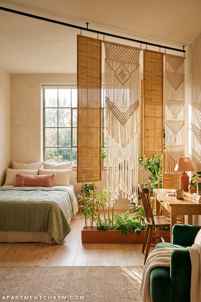
Next, study the main sightline. In a compact apartment, a divider that stops below the ceiling or includes generous openings can preserve a sense of depth. Where clutter is the problem, closed storage at the bottom with open shelving above gives the boundary enough weight to feel useful without becoming a blank wall. The divider design should also make sense from both directions; a piece that looks finished only from the living-room side may feel awkward from the bed or dining table.
Finally, decide how permanent the solution can be. Curtains and freestanding screens are adaptable, while floor-to-ceiling shelving, glazed frames, suspended panels, and wired lighting require more planning. Confirm what the floor, wall, and ceiling can support, follow the product’s installation instructions, and check lease or building requirements before drilling or altering fixed surfaces. The right room divider is not simply the most attractive option—it is the one whose privacy, visual weight, and practical demands match the space.
Natural and Textile Room Dividers That Keep Things Airy
Natural fibers, plants, and fabric create boundaries with softness rather than bulk. Their irregular textures catch light, keep the composition relaxed, and work especially well where the goal is to suggest a zone instead of constructing a full wall.
1. Set Birch Poles in a Slim White Planter
A row of pale birch poles behind a sofa gives the seating area a visible edge while keeping the room beyond in view. Leave irregular gaps and let the trunks’ natural markings vary instead of arranging them like identical dowels. Warm white walls, light oak, and mist-gray upholstery keep the palette quiet enough for the bark to become the defining texture.
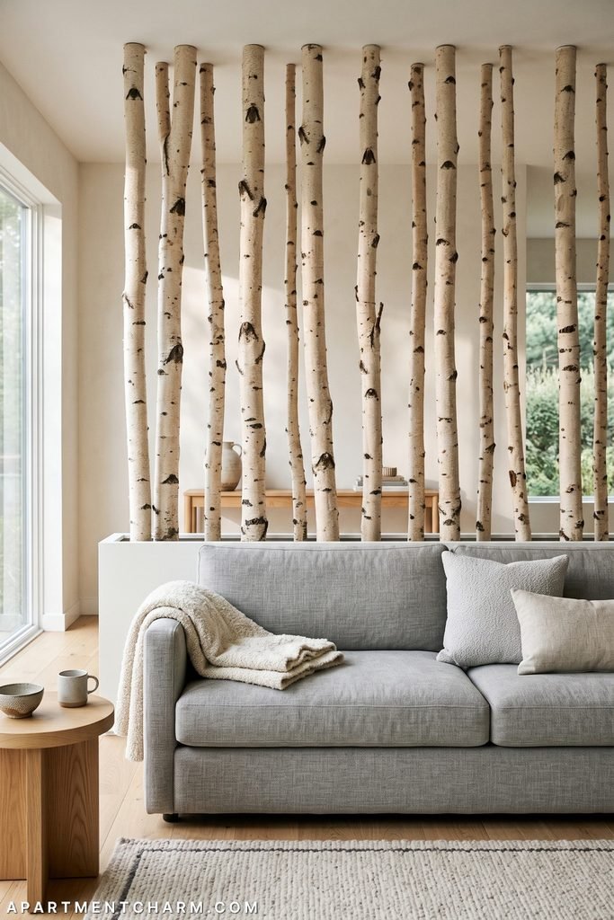
Choose a long, visually slim planter rather than a bulky box. Behind the sofa, its horizontal weight balances the trunks’ height and makes the furniture and divider read as one composition. Use properly dried decorative wood and a base or top connection designed to keep the assembly stable rather than relying on loose fill alone.
Find the Birch-and-White Foundation
To recreate this quiet divider, focus on naturally varied birch, a slim white base, and one mist-gray textile rather than filling the planter or sofa with extra accents.
- Tall Natural Birch Branches Decor
- Long White Rectangular Indoor Planters
- Light Gray Textured Pillow Covers
2. Grow a Tropical Bamboo-and-Plant Screen
For a bedroom that shares space with a desk, combine honey-toned bamboo canes with plants in a low trough. Dense foliage obscures cords and the lowest part of the bed, while the open bamboo canopy lets daylight travel above it. Density below and openness above provide privacy without sealing off either zone.
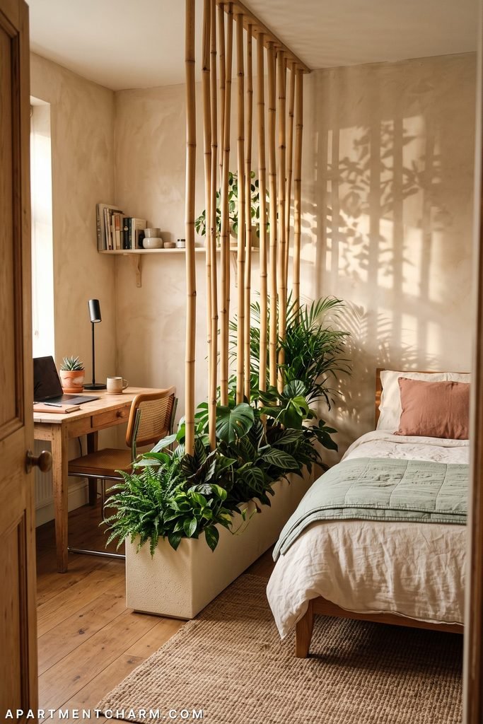
Cream bedding and walls prevent the greenery from becoming visually heavy, and a few dusty-terracotta ceramics can bridge the warm bamboo with the deeper plant tones. Keep the styling edited so the screen remains the focal feature rather than turning into a crowded plant shelf. Select plants for the actual light available, plan for drainage and access to watering, and make sure both the trough and canes are secured against tipping.
3. Layer Macramé Panels on a Ceiling Track
Several narrow macramé panels look more dimensional than one broad hanging. On a ceiling track, alternate slightly different widths, open knots, denser patterns, and uneven fringe. Overlaps add privacy where the weaves cross while looser sections pass light, and sliding individual panels lets the boundary change with the room.
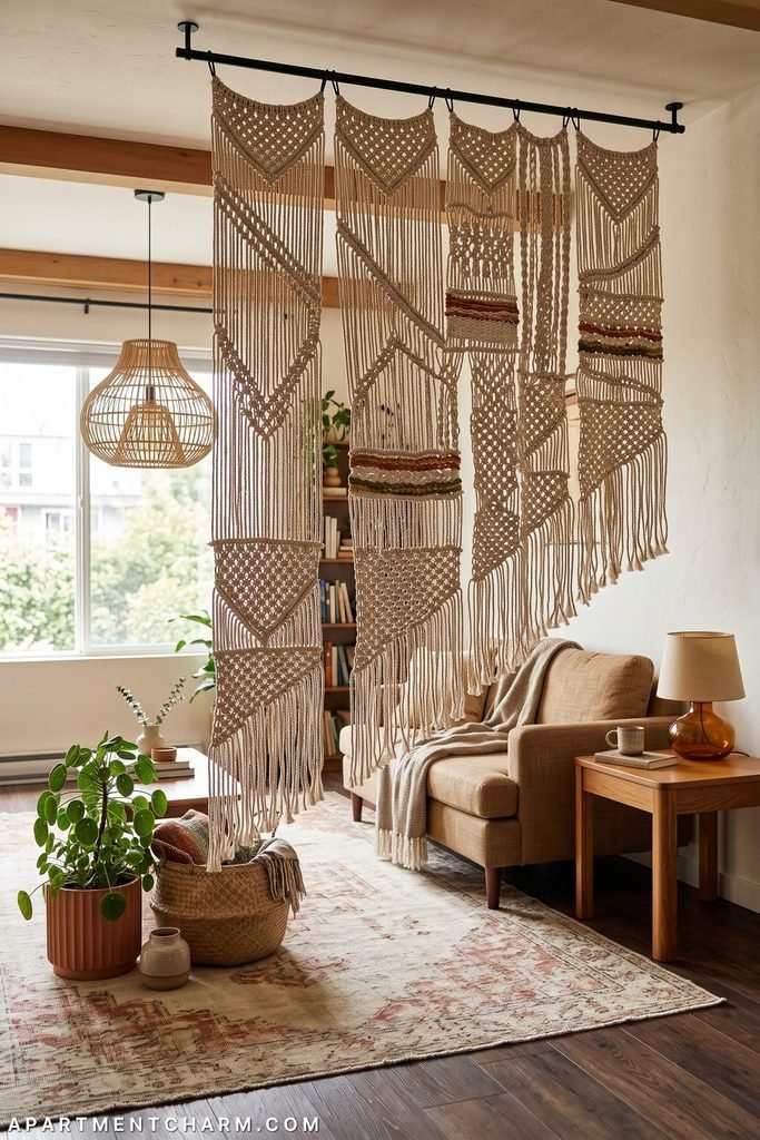
An ivory and natural-jute base can carry small notes of rust, faded red, and olive without making the textile feel overly decorative. Repeat those muted colors once or twice in a rug, plant pot, or basket, then let the knots provide most of the detail. Because a layered room divider curtain has more weight than it may appear to, use hardware rated for the complete assembly and mount it into suitable support. Keep hanging fibers away from heaters and open flames.
Build the Layered Macramé Treatment
Look for ivory panels with different knot densities, then repeat their natural texture once nearby with jute instead of adding more pattern or color.
4. Slide Woven Bamboo Panels Across a Sunny Opening
Woven bamboo panels turn direct sun into a shifting grid of shadow. A black ceiling rail gives the honey-colored weave a crisp outline, keeping the material from reading as rustic. Leave one panel partly open so the floor and ceiling remain visible into the next area, preserving depth when the dining zone is screened.
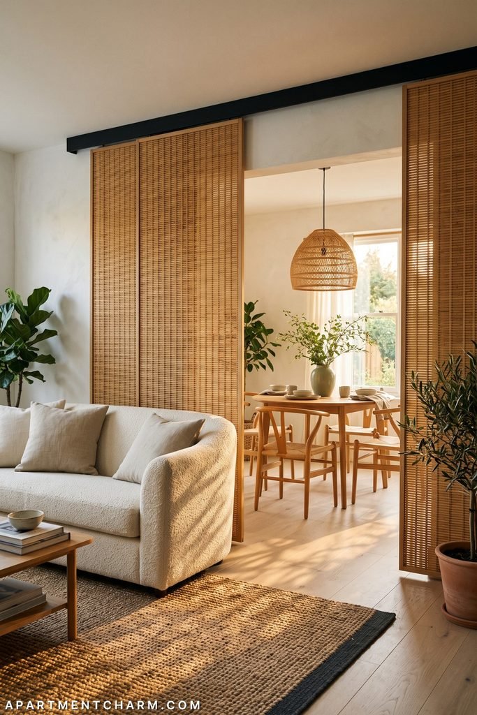
Cream upholstery, oat textiles, and green plants extend the organic palette without competing with the bamboo’s line pattern. The effect is strongest when the surrounding decor stays simple enough for the filtered light to animate the room throughout the day. Before installation, check the track’s mounting requirements and the combined panel weight. Also consider nearby heat sources and windows: the selected material and finish should be appropriate for its exposure and maintained according to its maker’s guidance.
5. Enclose an Emerald Reading Nook With Floral Curtains
A curtain room divider can feel like a small interior room when fabric and furnishings share a strong palette. Deep emerald creates the enclosure, while fuchsia and coral flowers keep the green from becoming somber. Cream in the print or upholstery separates those saturated hues, and aged brass supplies a smaller reflective accent.
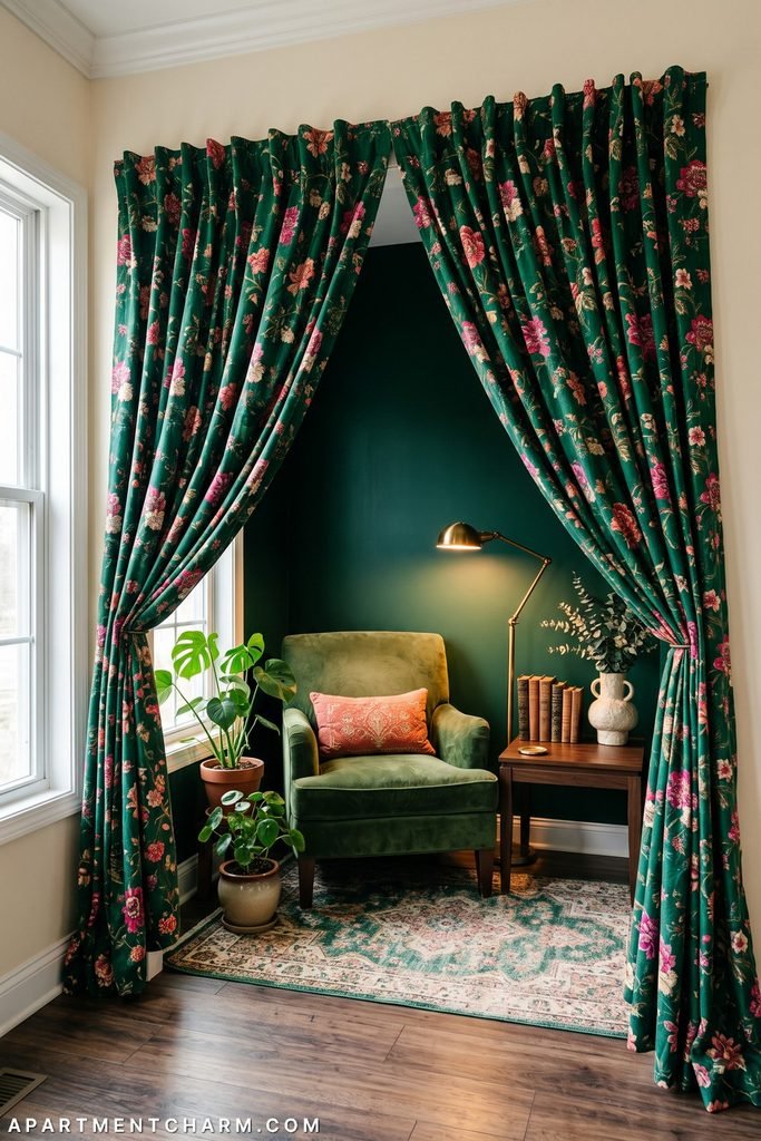
Inside, a velvet chair, dark wood table, patterned rug, books, and a few plants build a collected setting without filling every surface. Let the curtains stack generously so they frame the chair instead of hiding it. Open, the nook becomes a vivid portal; closed, it quiets the surrounding room. Use a properly supported track, and follow U.S. Fire Administration guidance to keep curtains and other combustible materials at least three feet from a portable space heater.
Recreate the Emerald Reading Nook
Let emerald floral fabric carry most of the color, then reinforce the enclosure with one velvet seat and a smaller aged-brass lighting accent.
6. Suspend Oak Slats From a Tension-Pole Frame
A black tension-pole frame with rope-hung oak slats provides a clean vertical boundary without pretending to be a solid wall. Pale wood keeps the structure approachable, while the dark posts sharpen the silhouette against white walls. Leave deliberate space between the slats; the repeated gaps are what make the divider feel tall and architectural without erasing the zone behind it.
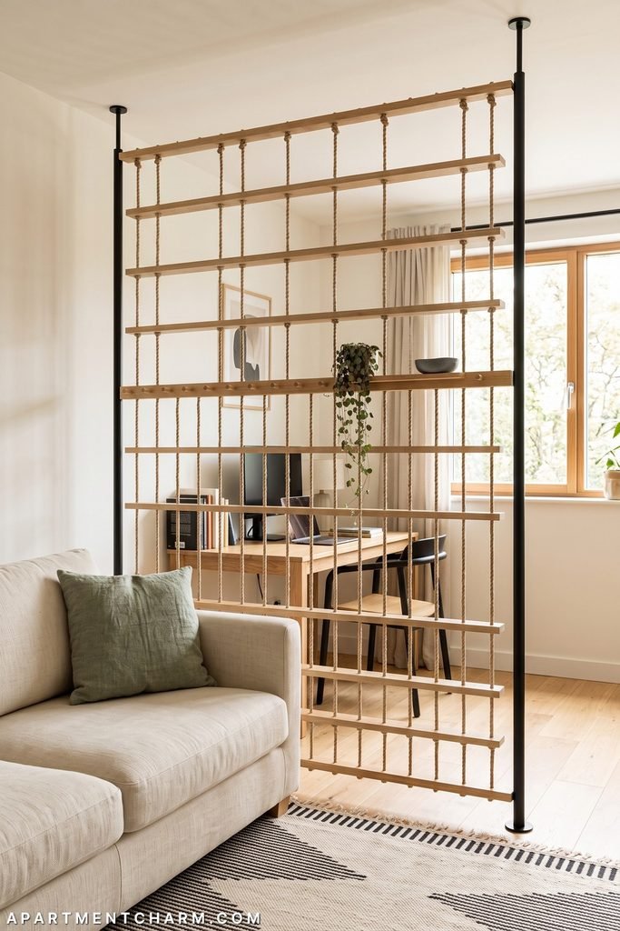
A narrow chalk ledge, peg rail, or plant shelf can give the screen a second role, but one functional strip is enough to preserve the pattern. Check the manufacturer’s surface, height, and load requirements. No-drill does not automatically mean damage-free or suitable for every ceiling and floor, so confirm lease rules and test the finish where appropriate.
Storage Room Dividers That Make Small Spaces Work Harder
Storage dividers earn their footprint by organizing both a layout and the objects inside it. The most successful examples control how much is open, how much is concealed, and where the eye is allowed to pass through.
7. Paint a Floor-to-Ceiling Library Divider Deep Green
A floor-to-ceiling bookcase becomes part of the architecture when it is painted the same deep forest green across its frame and cubbies. The saturated color gives books, pale oak accents, and terracotta vessels a strong background, while warm ivory nearby prevents the installation from feeling too dark. Trailing plants soften the grid and carry green beyond the painted surface in a more irregular form.
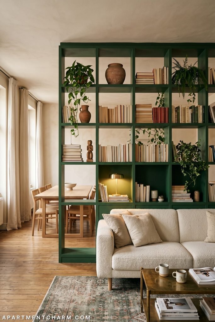
Leave roughly a third of the openings quiet so daylight and sightlines can pass and displayed pieces have more presence. Vary horizontal stacks, vertical rows, and a few sculptural objects instead of repeating one arrangement. Treat a divider this tall as furniture with tip-over risk: anchor it with appropriate hardware and follow the manufacturer’s instructions.
Style the Deep-Green Library Divider
Once the open storage is established, use terracotta and trailing greenery as limited warm and organic accents, leaving plenty of cubbies unfilled.
8. Combine Black Metal Shelves With Walnut Cabinets
Closed walnut cabinets at the bottom of a divider hide the objects that create visual noise, while slender black metal shelves above preserve connection between rooms. The dark framework outlines each opening, and the walnut gives the lower half enough warmth and mass to ground it. Against warm white walls, that contrast feels crisp without turning the divider into a black barrier.
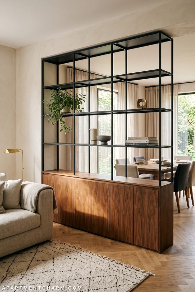
Use the upper shelves selectively—a sage-green plant, a few books, and ceramics with space around them. Objects seen from both rooms need finished backs or silhouettes worth viewing. Align some shelf edges with nearby furniture so the screen relates to the layout. Confirm that the system is designed for divider use, and secure tall units as directed instead of assuming the base provides stability.
9. Build a Double-Sided Cubby Headboard Between Two Beds
Two sleeping zones can share one central divider when a warm-white cubby unit also works as a headboard on both sides. Pale blue and sage bedding make the rooms feel related, but small changes in pillows or artwork keep them from becoming mirror images. Cane baskets in the lowest compartments introduce a natural texture and conceal loose items close to the floor.
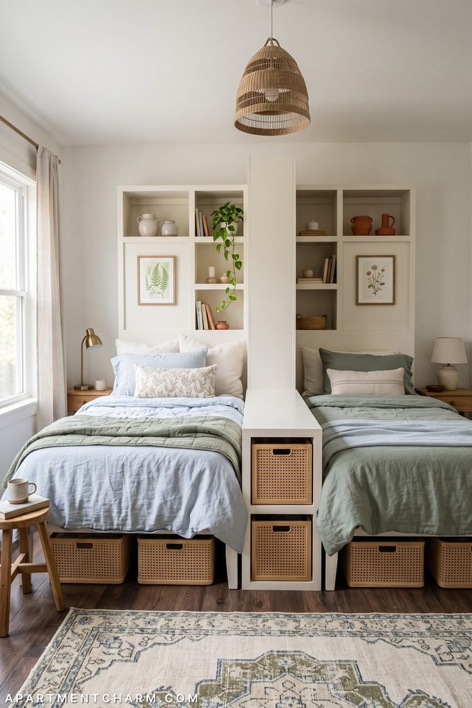
The bookcase should look finished from each bed. Keep upper cubbies open so the divider does not loom over the pillows, reserving denser storage for the base. Repeated baskets beneath the beds extend the storage rhythm beyond the partition. Maintain clear circulation around both sleeping areas, and secure the unit with a method appropriate to its height, construction, and site conditions.
Organize the Double-Sided Sleep Zones
Choose a simple white cubby structure, then repeat the same natural basket texture inside the unit and beneath the beds to make both sides feel related.
10. Use an Open Honeycomb Shelf as a Screen
Hexagonal cells turn an open shelf into a graphic room divider even before anything is placed inside it. Walnut gives the honeycomb warmth, while charcoal accents and green plants emphasize selected openings. The surrounding palette can stay mostly warm white so the geometry remains legible rather than competing with patterned walls or busy furniture.
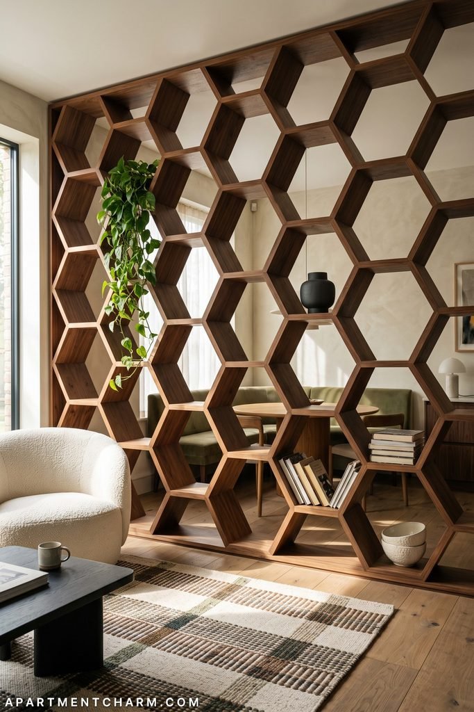
Fill only about a third of the cells and vary display scale. A small vessel beside a larger plant creates more rhythm than one object centered in every hexagon, while empty cells keep windows and distant color visible. The pattern provides zoning, not full privacy, so it suits a living-dining transition better than a concealed sleeping area. Verify the joinery, orientation, and anchoring method before placing a modular shelf away from a wall.
11. Frame the Room With an Oak Slat Portal and Bench
An oak portal can mark the threshold between zones while combining a slat screen, a built-in bench, closed storage, and softly lit display niches. The repeated verticals make the opening feel taller; the bench supplies horizontal weight at the bottom so the portal does not look like a decorative frame suspended in space. Cream upholstery and taupe stone keep the wood dominant, while small black details sharpen the edges.
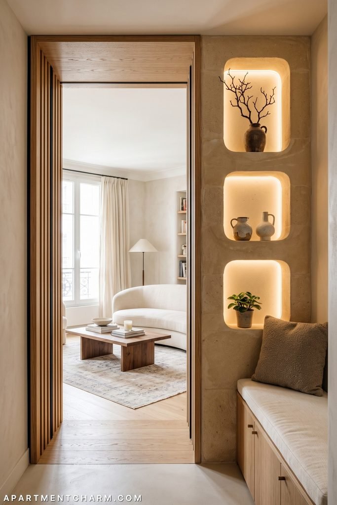
Keep the niches calm: a branch vase, two vessels, one plant, and a plain cushion are enough to make the architecture feel inhabited. Warm integrated light should graze the materials rather than overpower the adjacent room. Because this design combines cabinetry, structural attachment, seating, and electrical components, it is better developed as a coordinated built-in with qualified trades and access for future maintenance.
12. Make a Slim Media Wall Work From Both Sides
A narrow oak media wall can divide living and dining areas without spending its entire footprint on a television. Place the screen on the main seating side, use floating storage below it, and open a pass-through niche toward the other zone. The opening breaks up the wall’s mass and gives a terracotta object or small lamp a warm focal point visible from both directions.
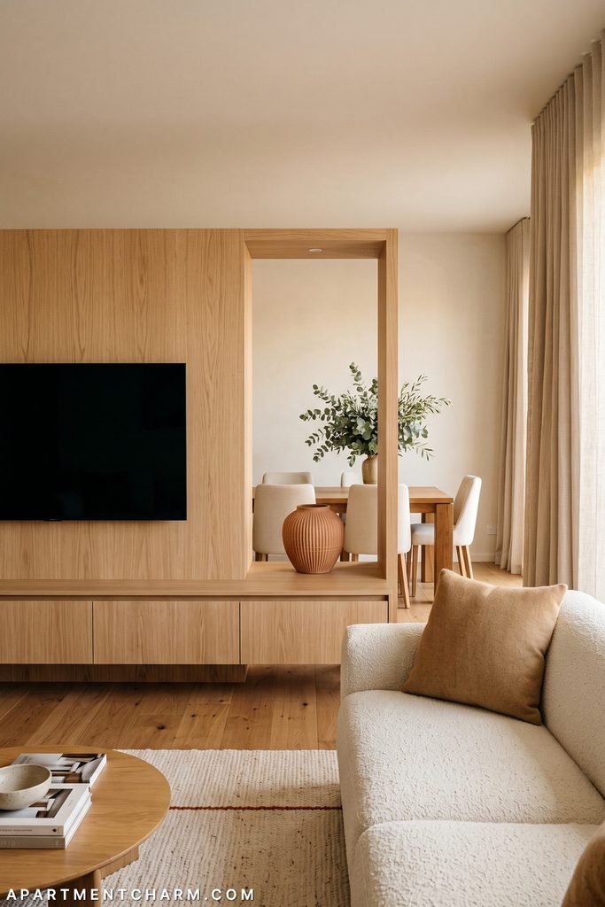
Light oak and ivory keep the structure bright, while the black television reads as one concentrated rectangle. Hide cables along an accessible route and accommodate airflow for electronics. The television and tall divider need appropriate support, and equipment clearances should follow manufacturer instructions. Check viewing height, glare, and walking paths before fixing the wall’s position.
Finish the Light-Oak Media Wall
Keep the supporting pieces visually quiet: light-oak storage maintains the pale wood plane, while discreet cable control protects the wall’s clean outline.
Glass and Light-Filtering Architectural Partitions
Glass, translucent stone, and framed panels divide a room while allowing light to remain part of the composition. Transparency is only one option: texture, color, artwork, and mixed materials can obscure details or redirect attention without producing a blank wall.
13. Hang Translucent Botanical Art Panels
Suspend three to five translucent botanical panels in a loose row and the divider becomes a gallery that can be read from either side. Pale blue, sage, ochre, and coral artwork feels gentle against warm white walls and light oak furniture, while the open floor beneath the panels keeps the room’s footprint visually continuous. Slight differences in panel height make the installation feel composed rather than office-like.
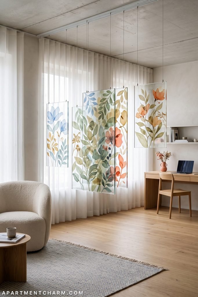
Let the artwork carry most of the color while nearby accessories remain quiet. Overlap two panels from the main viewpoint for more privacy, then leave wider gaps elsewhere for longer views. This solution zones rather than acoustically isolates. Use artwork you own or have permission to reproduce, match the suspension system to the panel weight and ceiling, and keep moving pieces clear of people and furniture.
Assemble the Botanical Panel Gallery
Build the suspended-gallery effect around delicate botanical imagery and transparent frames, keeping the sage-and-blue palette quieter than the panels’ spacing and overlap.
14. Let a Stained-Glass Screen Cast the Color
An Arts-and-Crafts stained-glass folding screen earns attention through transmitted color rather than a crowded collection of decor. Ruby, amber, cobalt, and teal pieces set in dark oak become especially vivid when daylight moves through them, scattering smaller jewel-toned reflections across an otherwise restrained floor and wall palette.
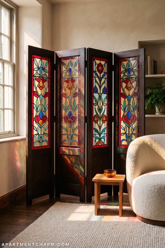
Keep surrounding upholstery and accessories quiet so the screen does not compete with another strong pattern. A single repeated blue or amber detail nearby is enough to connect it to the room. Position the screen where it receives light but does not obstruct a main walkway; the shifting shadows are part of the finished effect. Select a stable, properly constructed screen with suitable safety glazing or another appropriate infill, and use anti-tip measures where the design calls for them.
15. Enclose a Compact Office With Black-Framed Glass
A black Crittall-style glass enclosure gives a compact office a clear boundary while keeping the desk connected to the larger room. Matte black muntins add structure against ivory walls, and pale oak prevents the workspace from feeling severe. One green plant is enough to soften the grid without obscuring it.
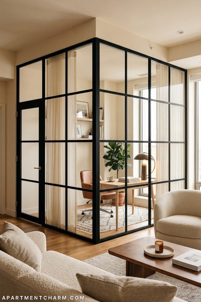
The frame pattern should relate to the office proportions: fewer, larger panes usually look calmer in a small footprint than a dense lattice. A sheer curtain inside can blur the desk during calls or at the end of the workday while allowing light to pass. This is a true architectural partition, so the layout must account for door swing or sliding clearance, ventilation, and a safe route of exit. Glazing requirements vary by location and application; use a qualified professional to specify and install the system under applicable local rules.
16. Mix Cane and Ribbed Glass in Rounded Black Frames
Rounded black capsule frames soften the hard geometry often associated with metal-and-glass partitions. Alternate cream cane inserts with ribbed glass so some sections conceal silhouettes more strongly while others admit a hazier view. The cane contributes warmth and fine texture; the glass reflects light and keeps the grouped forms from becoming visually flat.
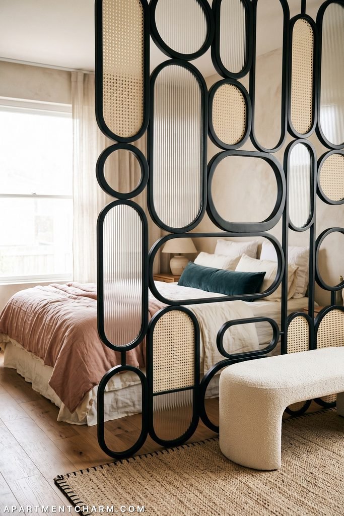
Dusty blush bedding and a restrained teal accent can sit behind the divider without competing with the black outline. Let part of the bed remain visible around the frame so the bedroom nook feels screened rather than boxed in. Unequal capsule sizes create movement, but repeating the same black border holds the composition together. Floor-to-ceiling frames require secure attachment, and both the glass and woven infill should be specified for their location, cleaning needs, and expected contact.
17. Build a Retro Color-Block Glass Divider
Textured panels in teal, mustard, amber, red, and smoky gray can turn a room divider into the palette setter for an entire apartment. Walnut framing tempers the brighter colors, while clear or lightly textured sections prevent the composition from becoming a solid mosaic. Small integrated display cubes give a terrarium, a plant, or one ceramic object a place to interrupt the colored grid.
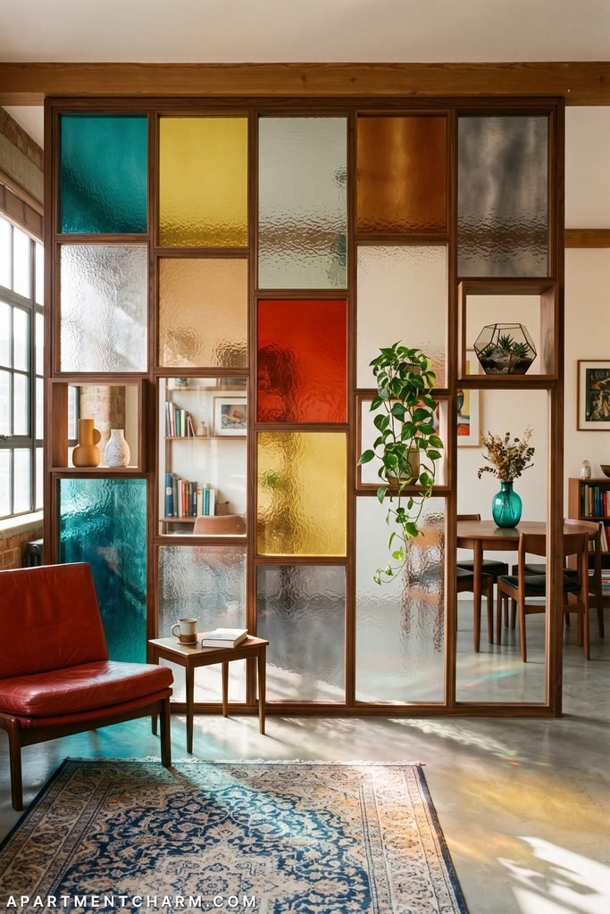
Let the divider distribute color rather than repeating every shade equally. A red chair on one side and blue-toned rug on the other carry selected hues into both zones. Texture diffuses outlines and daylight, offering more discretion than clear glass without promising complete privacy. Ask a glazing professional about material selection, edges, framing, and local requirements; an acrylic substitute is not automatically appropriate or safer in every application.
18. Pair Rippled-Glass Circles With Walnut and Cane
A walnut partition fitted with three large rippled-glass circles feels architectural, playful, and useful at once. Cane-front doors and arched open niches give the left side a fine woven rhythm, while the circular glass creates a larger, calmer counterpoint. Cream walls allow the silhouette to read clearly, and amber-tinted glass can deepen the walnut without introducing another unrelated color.
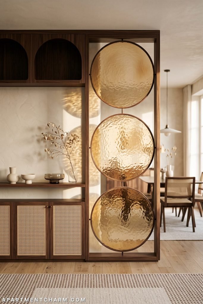
Keep the ledge lightly styled with two ceramics, a low bowl, and a branch rather than filling every opening. The circles already function as artwork; excess accessories would weaken their scale. Their vertically repeated shape also guides the eye upward while blurred views maintain a connection to the dining or work area beyond. Cabinetry, glazing, and the tall frame should be designed as one system, with appropriate support, finished edges, and professional installation where required.
19. Backlight Stone Beside Walnut Slats and Display Shelves
A softly backlit stone panel can act as a luminous center between dark walnut slats and rounded display shelves. Sand and champagne tones emerging through the stone relieve the visual weight of espresso wood, while slim bronze or black accents define the edges. This combination feels substantial because the surfaces are layered, yet the slats preserve narrow glimpses into the next room.
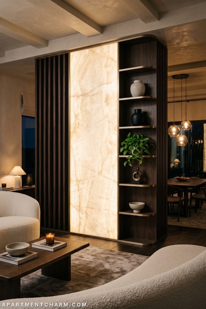
Limit the shelves to three to five objects with different silhouettes. Light should reveal the stone’s veining rather than turn the panel into a bright sign. Use an assembly specifically designed for illumination, with ventilation, service access, and electrical components planned by qualified professionals. The complete divider also needs support appropriate to its materials and height.
For more examples centered specifically on framed, frosted, colored, and movable glazing, explore these glass partition designs.
Decorative Screens and Sculptural Statement Dividers
Some creative room dividers are chosen less for concealment than for the way they reshape a room’s identity. Strong silhouettes, crafted surfaces, and controlled lighting allow the boundary itself to become the principal artwork.
20. Treat a Colorful Carved Folding Screen as Artwork
A hand-carved folk-art screen can carry the room’s strongest colors without requiring the rest of the decor to become equally busy. Vermilion, green, mustard, and teal details stand out against a soft gray or ivory setting, while the carved wood supplies shadows that change as you move past it. The folds create depth, so the pattern never reads like a flat printed backdrop.
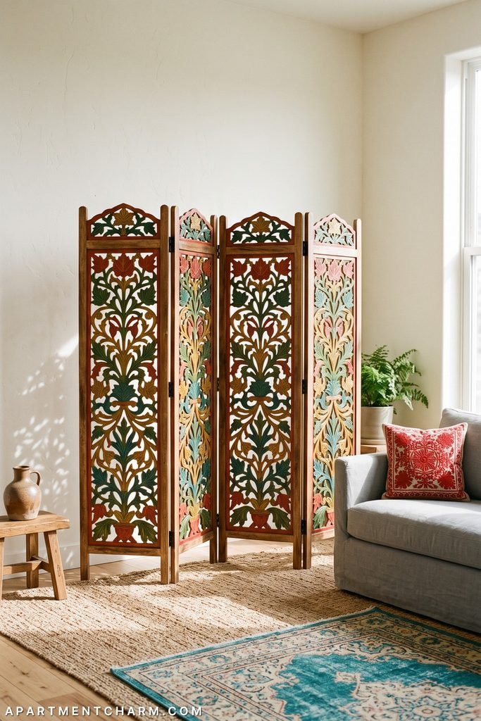
Repeat only two screen colors in a rug and one pillow. That limited echo links the artwork to the seating area while preserving it as the focal point. Leave room on both sides instead of adding tall plants or a gallery wall. Position the panels at a stable angle and use the recommended anti-tip or securing method, especially in a busy living area.
Echo the Folk-Art Screen Palette
Begin with the carved screen as the dominant artwork, then repeat only a few of its jewel tones in one rug and one textile accent.
- Hand-Carved Wood Folding Room Dividers
- Jewel-Tone Patterned Area Rugs
- Embroidered Jewel-Tone Pillow Covers
21. Create a Gothic Botanical Reading-Nook Screen
A screen built from cathedral arches and botanical cutwork gives a reading nook a darker, more immersive edge. Oxblood, moss, aubergine, and ink blue can live together because antique-gold highlights and warm lamplight lift the carved detail. A velvet chair and low patterned rug continue the tactile richness, while dark bookshelves help the screen feel rooted in the room rather than placed in front of it.
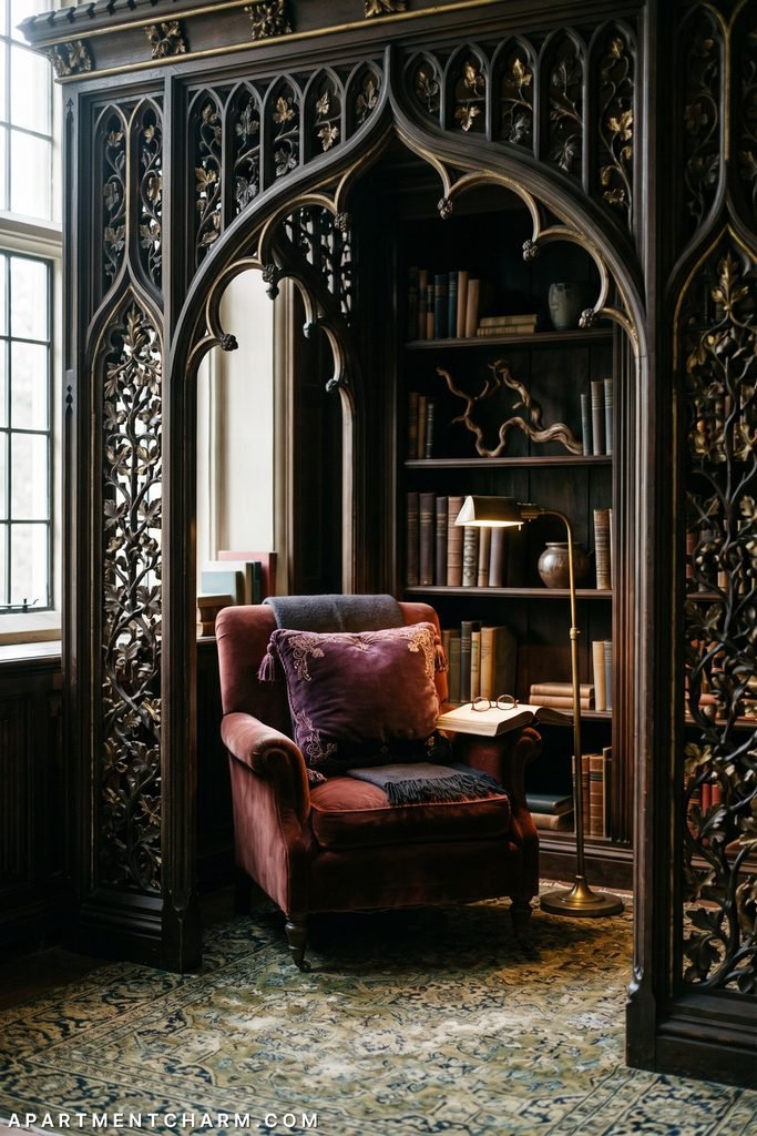
Limit supporting objects to books, one lamp, and perhaps a branch arrangement. The arches and foliage already provide dense pattern, so plain upholstery creates needed pauses. Smooth exposed edges, use original or properly licensed artwork for custom cutting, and stabilize the screen. If children use the space, avoid climbable details and choose an installation method suited to the panel’s weight.
22. Contrast Black Cutwork With Cognac Leather
Black laser-cut panels create a crisp lace-like boundary when set against cognac leather and white stone. The leather’s broad, warm surface makes the fine dark pattern easier to read, while a cream wall or pale marble floor prevents the composition from becoming too dense. One green plant adds an organic shape without diluting the limited palette.
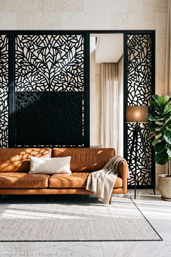
A tripod lamp and a plain cushion are enough alongside the screen; elaborate textiles would compete with the cutwork. Adjust privacy through pattern density—more open areas can frame long views, while tighter sections can align with the part of the sofa or dining table you want to screen. Custom panels should have smooth, protected edges and a secure base or frame. Confirm the chosen material, finish, and attachment method are appropriate for indoor use and the divider’s scale.
Recreate the Black-and-Cognac Contrast
Preserve the limited material story by pairing one fine-patterned black divider with a broad cognac leather surface and a simple tripod lamp.
23. Place an Organic Pebble-Cut Wood Screen Behind a Curved Sofa
An oak screen with large, irregular pebble-shaped openings complements a curved sofa because neither element relies on rigid right angles. Caramel wood warms white and mushroom upholstery, while charcoal accents keep the pale room from losing definition. The broad cutouts maintain strong sightlines and turn the wall behind the sofa into a sequence of framed views.
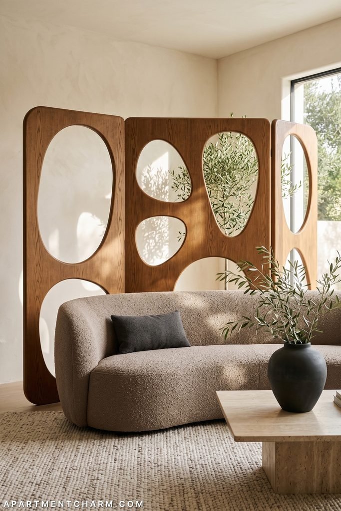
Keep the foreground especially spare: one low table and a substantial vessel allow the relationship between sofa and screen to remain the main event. Artwork behind the cutouts would create competing layers, so let wall color and distant architecture show through instead. The openings should be engineered with adequate material around them, and all edges need a smooth finish. Treat a large panel as an architectural element that requires suitable structural support, not as lightweight decorative art.
24. Shape Copper Mesh Into a Ribbon Divider
Copper mesh can be curved into looping ribbons that overlap, open, and narrow across a room. The material’s transparency keeps the large sculpture from becoming a solid obstacle, while bronze and copper tones collect warm highlights throughout the folds. Sand-colored flooring and warm white walls give the metal room to cast intricate shadows without adding another pattern.
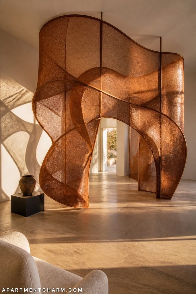
This divider benefits from restraint around it. A single dark pedestal or low bench can provide scale, but extra artwork would compete with the changing negative spaces. The beauty comes from the tension between the mesh’s industrial surface and its soft, almost fabric-like curves. Because the form depends on controlled bends, finished edges, and reliable supports, it is a custom-fabrication project. Specify rounded or protected edges and secure the structure at the required points with professional input.
25. Illuminate a Wavy Walnut-and-Rippled-Glass Divider
Dark walnut panels carved into long, wave-like recesses become especially sculptural when warm light traces their curves. Narrow rippled-glass sections introduce a cooler reflective texture between the wood forms, so the divider feels layered rather than monolithic. Champagne light, ivory walls, and small black details keep the glow refined, while one green plant provides a living countershape.
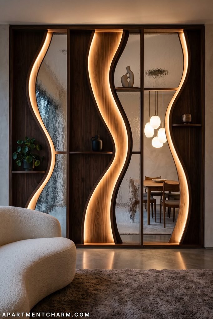
Three or four objects are enough for the integrated shelves: vary their heights and leave entire areas empty so the illuminated waves remain dominant. The design can separate living and dining areas while functioning as a tall focal artwork from both sides. Plan the woodwork, glazing, wiring, ventilation, switching, and service access together; hiding those practical systems after fabrication can compromise the clean silhouette. A divider of this scale also requires appropriate anchoring and professional coordination.
What to Check Before You Install a Room Divider
Mark the proposed divider on the floor with removable tape, then walk the room as you normally would. Check door swings, access to windows and storage, furniture pull-out space, and the path from one zone to another. View the mark from seated and standing positions; a screen that looks light from the doorway may interrupt the most important sightline from the sofa or bed. Confirm that vents, radiators, outlets, and switches will remain accessible after the divider is in place.
For shelving, media walls, and tall cabinets, follow the manufacturer’s anchoring instructions. The U.S. Consumer Product Safety Commission specifically advises securing top-heavy furniture and TVs and mounting or anchoring flat-screen televisions rather than leaving them unsecured. Do not place climb-enticing objects high on an open divider, and consider how children or pets might interact with its openings.
Mounted glass, suspended panels, and custom built-ins require a closer review of supports, edges, access, and applicable local requirements. International Residential Code provisions identify specific hazardous locations where safety glazing is required, but the rule for a particular interior depends on the installation and locally adopted code. A qualified installer or local building professional can determine what is appropriate. For illuminated partitions, allow access to drivers, wiring, and ventilation instead of sealing electrical components into millwork. Finally, confirm landlord, condo, or building approval before making permanent changes.
Frequently Asked Questions
What type of room divider gives privacy without blocking all the light?
Textured or ribbed glass, cane, woven bamboo, macramé, mesh, and closely spaced slats all soften a view while allowing some light through. The right choice depends on how much detail you want to obscure. Denser patterns and overlapping layers increase visual privacy; larger gaps preserve stronger sightlines. None should be assumed to provide sound isolation simply because it reduces visibility.
Can a bookcase be used safely as a room divider?
Yes, if the bookcase is designed or properly adapted for that orientation and secured as instructed. A unit standing away from a wall exposes both sides and may behave differently from one placed against a wall. Confirm anchoring, load distribution, and finished backing, and keep heavier objects low. Tall, top-heavy furniture should not be left unsecured.
Do decorative room dividers reduce noise?
Soft textiles, books, and irregular surfaces may reduce some reflected sound within a room, but a decorative divider does not automatically provide meaningful sound isolation between zones. That performance depends on the complete assembly, its gaps, mass, seals, and tested ratings. For a quiet office or bedroom, treat acoustics as a separate requirement and consult product documentation or a qualified professional.
Are tension-pole and freestanding dividers always renter-friendly?
No. A no-drill installation can still mark a finish, place pressure on unsuitable surfaces, exceed a product’s height or load limits, or conflict with lease rules. Freestanding screens can also tip if poorly placed. Check the manufacturer’s requirements and obtain permission when your lease or building rules call for it; “renter-friendly” should describe a verified setup, not an assumption.
Choose the Divider Your Room Actually Needs
Successful room dividers begin with a clear purpose. Decide whether the layout needs a visual cue, greater privacy, storage, or a more complete room-within-a-room, then protect the light and paths that already work. From a loose bamboo screen to an illuminated walnut installation, the strongest choice repeats something nearby while adding one new function or material. When permanence, anchoring, glazing, and maintenance match the space and your daily routine, a divider can define the room without making it feel divided.